Airbnb Privacy Hub
CLIENT
ROLE
Strategy & Design Lead
DURATION
4 weeks
The Airbnb Privacy Hub project was an opportunity to turn a placeholder page into a clear, trustworthy destination for users seeking control over their data. I led the design from start to finish—shaping strategy, content, and UI to match Airbnb’s standards while addressing real user concerns. I created a structured, transparent experience that built trust and empowered action. The result was a page that feels calm, clear, and genuinely helpful—fully aligned with Airbnb’s brand and users’ expectations.
OVERVIEW
I began with research and discovery, reviewing research decks and past insights to build a foundational understanding. From there, I conducted competitive benchmarking (Google, Apple, Amazon, Uber) and audited Airbnb’s own tone, content, visual language, and design system usage across web properties.
These efforts revealed consistent gaps: users lacked access to clear, digestible resources and felt limited in how they could control their data. While trust in the brand was high, awareness and usability around privacy tools were low—insights that shaped the structure and messaging of the new Privacy Hub.
Competitive Benchmarking
I benchmarked leaders like Apple and Google to understand how they communicate privacy clearly—what they prioritize, how they structure information, and where they build user trust.
Apple Privacy


Google Privacy Center
Brand Immersion
As part of the early discovery phase, I immersed myself in Airbnb’s brand guidelines, design systems, and site patterns to ensure strategic and visual alignment.


I proposed a content and UX structure focused on three priorities: build trust through transparency, simplify access to controls, and clarify how Airbnb protects user data. I aligned these goals with design system constraints and brand tone, then collaborated with the Privacy PM and content leads to shape a strong narrative that could scale.
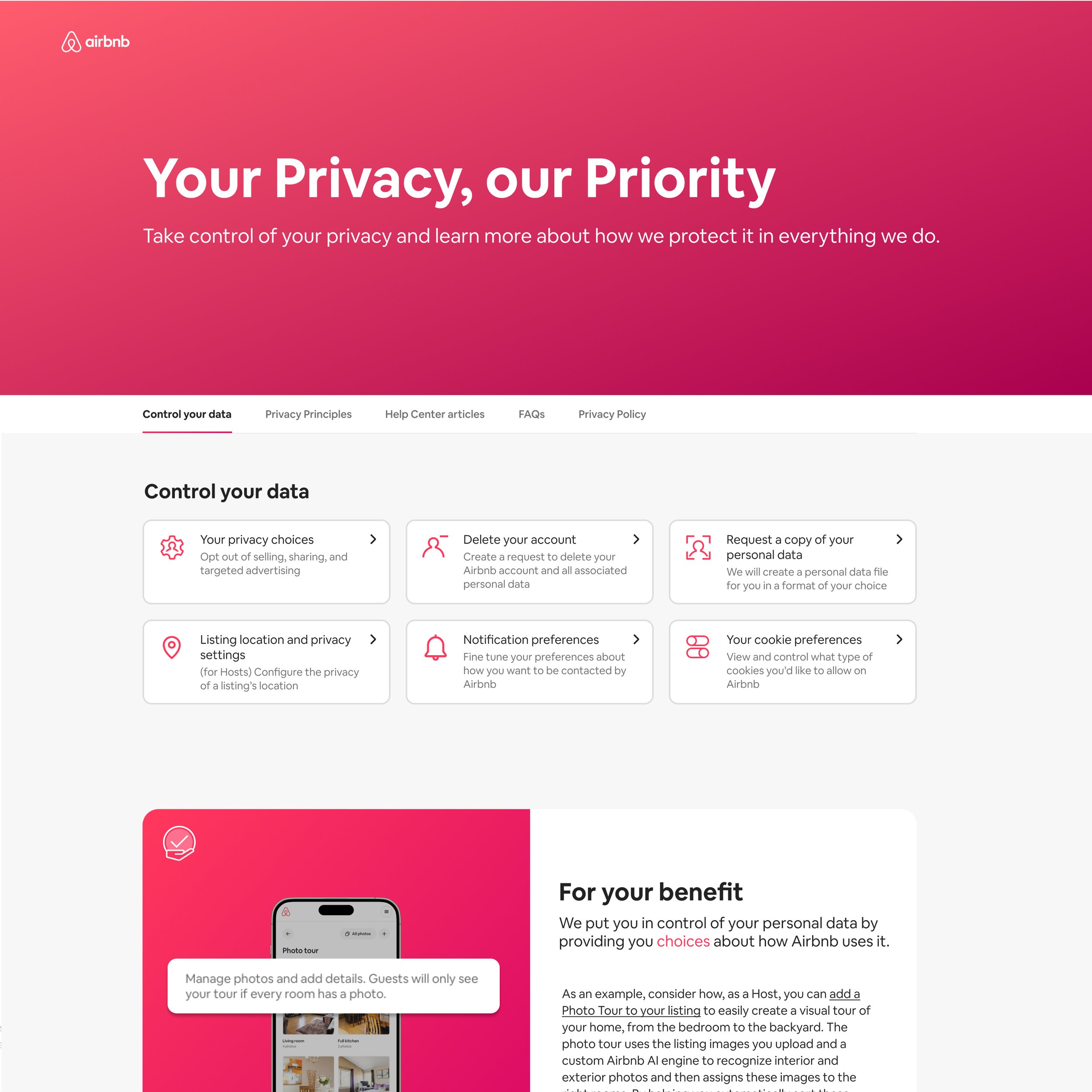
The final page opened with a typographic-led hero that framed Airbnb’s commitment to privacy while acknowledging common user concerns. A sticky nav helped users browse a dense page intuitively. I then introduced a card grid with quick-access privacy tools, followed by a carousel of privacy principles paired with product screenshots, a side-scroll of Help Center articles, and a rich FAQ section. Every section was built using Airbnb’s design system components for seamless integration and visual consistency.
Final Design
Outcomes
Increased Transparency
A new navigation element reinforcing Procore’s differentiators.
Improved Access to Controls
A redesigned layout made it easier for users to find and manage their privacy settings.
Stronger Brand Alignment
The new design followed Airbnb’s system guidelines while elevating tone, trust, and clarity.