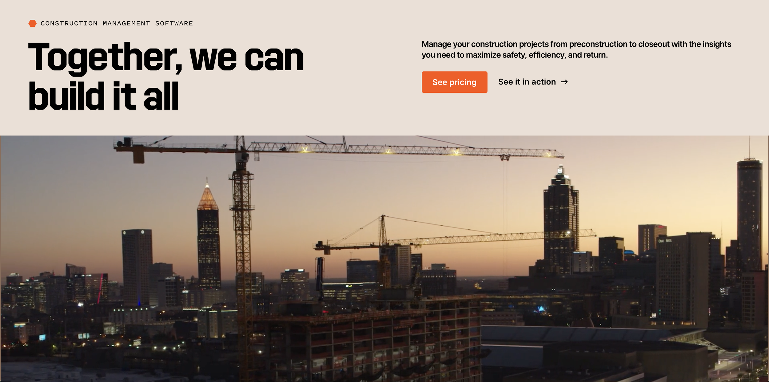
Procore Website Refresh
CLIENT
ROLE
Strategy Lead, UX
DURATION
11 weeks
Procore, a leading construction management platform, needed a website refresh to better communicate its story, improve navigation, and clarify its offerings. Our team refined the information architecture, created reusable UX/UI modules, and redesigned the About Procore experience. The project balanced brand expression with usability, ensuring a scalable and cohesive digital presence.
OVERVIEW

To begin the project, I led stakeholder interviews, a design system audit, extensive benchmarking, and competitive research to identify three key insights:
Clarify Procore’s Story
As the only company specializing in construction management software, Procore needed to better communicate its unique positioning. We also leveraged its recent rebrand as a storytelling element.
Improve Resource Access
Stakeholders emphasized that users valued Procore’s extensive resources but often struggled to find them.
Streamline Offerings
We organized solutions by role, aligning with insights from past research to improve clarity and navigation.
Key findings slide
An audit of page types on the site
From these insights, we implemented three strategic updates to the Navigation and Information Architecture:
Introduced 'Why Procore'
A new navigation element reinforcing Procore’s differentiators.
Featured Content Hub
Highlight high-value resources for easier access.
Audience-Based Navigation
Organized solutions by user type, making it easier to find relevant information.
This excerpt from the IA highlights the addition of the 'Why Procore' element. Due to NDA restrictions, the full IA cannot be shared.
A slide outlining key improvements in the proposed navigation
An annotated wireframe of the navigation module
Building on our research, we expanded Procore’s design system with five reusable UX/UI modules—enhancing flexibility while reinforcing storytelling.
We provided strategic guidance on usage, storytelling, and implementation.
‘Big Moment’ Hero
A high-impact hero section for key messaging
Mobile
Tablet
Desktop
Navigation Module
A scalable framework for intuitive wayfinding
Expanded view of the 'Solutions' menu
‘Who We Serve’
‘Resources’
‘Support’
Tiles
A structured, scannable way to tell a story
Tablet
Mobile
Desktop
Additional tile variations showcasing their versatility across different layouts, formats, and content types:
‘Swiss Army Knife’
A flexible content block for a wide variety of needs
A variation of the 'Swiss Army Knife' module showcases all available elements: tabs, header text, primary and secondary CTAs, paragraph text, search bar, and quick links
Header, search bar, quick links
Header & quick links
Tabs, header, paragraph, quick links
Testimonial Module
A dynamic way to showcase social proof
Tablet
Mobile
Desktop
Though not initially in scope, our research highlighted the need for a stronger 'About Procore' experience. We unified five disparate pages into a single, compelling narrative, incorporating social proof, case studies, and Procore’s updated brand identity.
Summary of outcomes:
Delivered a refined IA and navigation framework.
Improved resource discoverability with a structured content strategy.
Developed 5+ reusable UX/UI modules, strengthening the design system.
Enhanced UX and brand cohesion across the site, aligning with Procore’s rebrand.
Designed a cohesive About Procore experience, reinforcing brand storytelling.
Leveraged collaboration across strategy, brand, and design teams to drive user and business impact.
